To begun the session with,we introduce:
PERMAP is a program that
uses multidimensional scaling (MDS) to reduce multiple pair wise relationships
to 2-D pictures, commonly called perceptual maps. The Churchill data are in the
form of correlation coefficients that show the relationships between 10 factors
that influence the image of a department store. These correlation coefficients
were calculated from responses to semantic differential scale questions given
to a random selection of shoppers.
Purpose of PERMAP. The use of MDS
for the construction of perceptual maps is well developed and several computer
programs are available. In fact, MDS was one of the earliest uses of high-speed
computers in psychology and the social sciences. The purpose of PERMAP is to provide
a particularly convenient method of producing perceptual maps and to do so in a
way that helps the researcher avoid a number of common mistakes, as described
in following sections.
Usefulness of perceptual maps: A major
advantage of MDS and perceptual maps is that they deal with problems associated
with substantiating and communicating results based on data involving more than
two dimensions. They discussed the importance of graphical communications and
the role of the eye in interpreting and distinguishing object (factor,
stimulus, characteristic) grouping.
Although experts may be able to
extract the subtle relationships represented in a matrix of numbers, this skill
is not widespread. Another important aspect of perceptual maps is that they are
forgiving of missing or imprecise data points. Whereas some analytical
techniques cannot tolerate missing elements in the input matrix, MDS results
are often unaffected. This is because it is not uncommon for there to be much
redundancy in the information given by a complete matrix of dissimilarities.

Standard Score or Z Score
The standard score (more commonly referred to
as a z-score) is a very useful statistic because it (a) allows us to calculate
the probability of a score occurring within our normal distribution and (b)
enables us to compare two scores that are from different normal distributions.
The standard score does this by converting (in other words, standardizing)
scores in a normal distribution to z-scores in what becomes a standard normal
distribution.
Example I :
Setting the Scene : Part 1
A tutor sets a piece of
English Literature coursework for the 50 students in his class. We make the
assumption that when the scores are presented on a histogram, the data is found
to be normally distributed. The mean score is 60 out of 100 and the standard
deviation (in other words, the variation in the scores) is 15 marks.
Having looked at the performance of the tutor's class, one student,
Sarah, has asked the tutor if, by scoring 70 out of 100, she has done well.
Bearing in mind that the mean score was 60 out of 100 and that Sarah scored 70,
then at first sight it may appear that since Sarah has scored 10 marks above
the 'average' mark, she has achieved one of the best marks. However, this does
not take into consideration the variation in scores amongst the 50 students (in
other words, the standard deviation). After all, if the standard deviation is
15, then there is a reasonable amount of variation amongst the scores when
compared with the mean.
Whilst Sarah has still scored much higher than the mean score, she has
not necessarily achieved one of the best marks in her class. The question
arises: How well did Sarah perform in her English Literature coursework
compared to the other 50 students? Before answering this question, let us look
at another problem.
The tutor has a dilemma. In the next academic year, he must choose which
of his students have performed well enough to be entered into an advanced
English Literature class. He decides to use the coursework scores as an
indicator of the performance of his students. As such, he feels that only those
students that are in the top 10% of the class should be entered into the
advanced English Literature class. The question arises: Which students came in
the top 10% of the class?
Therefore, we are left with two questions to answer. First, how well did
Sarah perform in her English Literature coursework compared to the other 50
students? Second, which students came in the top 10% of the class?
Whilst it is possible to calculate the answer to both of these questions
using the existing mean score and standard deviation, this is very complex.
Therefore, statisticians have come up with probability distributions,
which are ways of calculating the probability of a score occurring for a number
of common distributions, such as the normal distribution. In our case, we make
the assumption that the students' scores are normally distributed. As such, we
can use something called the standard normal distribution and
its related z-scores to answer these questions much more
easily.
Standard Normal Distribution and Standard Score (z-score)
When a frequency distribution is normally distributed, we can find out
the probability of a score occurring by standardising the scores, known as
standard scores (or z scores). The standard normal distribution simply converts
the group of data in our frequency distribution such that the mean is 0 and the
standard deviation is 1 (see below).
Z-scores are expressed in terms of standard deviations from their means.
Resultantly, these z-scores have a distribution with a mean of 0 and a standard
deviation of 1. The formula for calculating the standard score is given below:
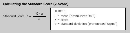
As the formula shows, the standard score is simply the score, minus the
mean score, divided by the standard deviation. Therefore, let's return to our
two questions.
1. How well did Sarah perform in her English Literature coursework
compared to the other 50 students?
To answer this question, we can re-phrase it as: What percentage (or
number) of students scored higher than Sarah and what percentage (or number) of
students scored lower than Sarah? First, let's reiterate that Sarah scored 70
out of 100, the mean score was 60, and the standard deviation was 15 (see
below).
|
|
Score
|
Mean
|
Standard Deviation
|
|
|
(X)
|
µ
|
s
|
|
English
Literature
|
70
|
60
|
15
|
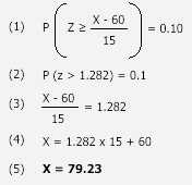
In terms of z-scores, this gives us:

The z-score is 0.67 (to 2 decimal places), but now we need to work out
the percentage (or number) of students that scored higher and lower than Sarah.
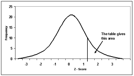
To do this, we need to refer to the standard normal distribution table.
This table helps us to identify the probability that a score is greater
or less than our z-score score. To use the table, which is easier than it might
look at first sight, we start with our z-score, 0.67 (if our
z-score had more than two decimal places, for example, ours was 0.6667, we
would round it up or down accordingly; hence, 0.6667 would become 0.67). The
y-axis in the table highlights the first two digits of our z-score and the
x-axis the second decimal place. Therefore, we start with the y-axis, finding
0.6, and then move along the x-axis until we find 0.07, before finally reading
off the appropriate number; in this case, 0.2514. This means that
the probability of a score being greater than 0.67 is 0.2514. If we look at
this as a percentage, we simply times the score by 100; hence 0.2514 x 100 =
25.14%. In other words, around 25% of the class got a better mark than Sarah
(roughly 25 students since there is no such thing as part of a student!).
Going back to our question, "How well did Sarah perform in her
English Literature coursework compared to the other 50 students?", clearly
we can see that Sarah did better than a large proportion of students, with 74.86% of
the class scoring lower than her (100% - 25.14% = 74.86%). We can also see how
well she performed relative to the mean score by subtracting her score from the
mean (0.5 - 0.2514 = 0.2486). Hence, 24.86% of the scores
(0.2486 x 100 = 24.86%) were lower than Sarah's, but above the mean score.
However, the key finding is that Sarah's score was not one of the best marks.
It wasn't even in the top 10% of scores in the class, even though at first
sight we may have expected it to be. This leads us onto the second question.
2. Which students came in the top 10% of the class?
A better way of phrasing this would be to ask: What mark would a student
have to achieve to be in the top 10% of the class and qualify for the advanced
English Literature class?
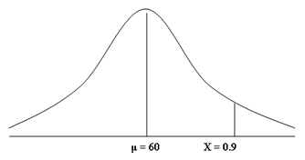
To answer this question, we need to find the mark (which we call
"X") on our frequency distribution that reflects the top 10% of
marks. Since the mean score was 60 out of 100, we immediately know that the
mark will be greater than 60. After all, if we refer to our frequency
distribution below, we are interested in the area to the right of the mean
score of 60 that reflects the top 10% of marks (shaded in red). As a decimal,
the top 10% of marks would be those marks above 0.9 (i.e., 100% - 90% = 10% or
1 - 0.9 = 0.1).
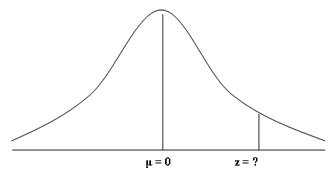
First, we should convert our frequency distribution into a standard
normal distribution as discussed in the opening paragraphs of this guide. As
such, our mean score of 60 becomes 0 and the score (X) we are looking for, 0.9,
becomes our z-score, which is currently unknown. Note the changes to the
labelling of the x-axis.
The next step involves finding out the value for our z-score. To do
this, we refer back to the standard normal distribution table.
In answering the first question in this guide, we already knew the
z-score, 0.67, which we used to find the appropriate percentage (or number) of
students that scored higher than Sarah, 0.2514 (i.e., 25.14% or roughly 25
students achieve a higher mark than Sarah). Using the z-score, 0.67, and the
y-axis and x-axis of the standard normal distribution table, this guided us to
the appropriate value, 0.2514. In this case, we need to do the exact reverse to
find our z-score.
We know the percentage we are trying to find, the top 10% of students,
corresponds to 0.9. As such, we first need to find the value 0.9 in standard
normal distribution table. When looking at the table, you may notice that the
closest value to 0.9 is 0.8997. If we take the 0.8997 value as our starting
point and then follow this row across to the left, we are presented with the
first part of the z-score. You will notice that the value on the y-axis for
0.8997 is 1.2. We now need to do the same for the x-axis, using the 0.8997
value as our starting point and following the column up. This time, the value
on the x-axis for 0.8997 is 0.08. This forms the second part of the z-score.
Putting these two values together, the z-score for 0.8997 is 1.28 (i.e., 1.2 +
0.08 = 1.28).
There is only one problem with this z-score; that is, it is based on a
value of 0.8997 rather than the 0.9 value we are interested in. This is one of
the difficulties of refer to the standard normal distribution table because it
cannot give every possible z-score value (that we require a quite enormous
table!). Therefore, you can either take the closest two values, 0.8997 and
0.9015, to your desired value, 0.9, which reflect the z-scores of 1.28 and
1.29, and then calculate the exact value of "z" for 0.9, or you can
use a z-score calculator. If we use a z-score calculator, our value of 0.9
corresponds with a z-score of 1.282. In other words, P ( z > 1.282 ) = 0.1.
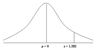
Now that we have the key information (that is, the mean score, µ, the
standard deviation, s , and z-score, z), we can answer our question directly,
namely: What mark would a student have to achieve to be in the top 10% of the
class and qualify for the advanced English Literature class? First, let us
reiterate the facts:
|
Score
|
Mean
|
Standard Deviation
|
z-score
|
|
(X)
|
µ
|
s
|
z
|
|
?
|
60
|
15
|
1.282
|
To find out the relevant score, we apply the following formula:
Therefore, students that scored above 79.23 marks out of 100 came in the
top 10% of the English Literature class, qualifying for the advanced English
Literature class as a result.
Setting the scene: Part II
Clearly, the z-score statistic is helpful in highlighting how Sarah
performed in her English Literature coursework and what mark a student would
have to achieve to be in the top 10% of the class and qualify for the advanced
English Literature class. However, we have only been talking about one
distribution here, namely the distribution of scores amongst 50 students that
completed a piece of English Literature coursework. What if Sarah wanted to
compare how well she performed in her Maths coursework compared with her English
Literature coursework?
In this case, Sarah achieved a higher mark in her Maths coursework, 72
out of 100. However, as we have already learnt, just because her Maths score
(72) is higher than her English Literature score (70), we shouldn't assume that
she performed better in her Maths coursework compared to her English Literature
coursework. The question therefore arises: How well did Sarah perform in her
Maths coursework compared to her English Literature coursework?
Clearly, the two scores (her English Literature and Maths coursework
marks) come from different distributions. The distribution of 50 students that
completed the English Literature coursework has a mean of 60 and standard
deviation of 15. The distribution of 50 students that completed the Maths
coursework, on the other hand, has a mean of 68 and a standard deviation of 6.
This gives us the following:
|
|
Score
|
Mean
|
Standard Deviation
|
|
|
(X)
|
µ
|
s
|
|
English Literature
|
70
|
60
|
15
|
|
Maths
|
72
|
68
|
6
|
Since these scores are from two different distributions, we need to
standardise them into z-scores so that they can be directly compared. This
gives us:
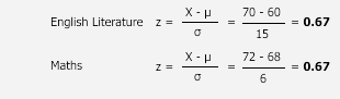
The z-scores highlight that the student is two thirds (z = 0.67) of a
standard deviation above the mean in English Literature, but also two thirds (z
= 0.67) of a standard deviation above the mean in Maths. Using the standard
normal distribution table, we can see that Sarah clearly performed above
'average' in both subjects although again, around 25% of the class got a better
mark than her. However, the key point her is that the standard score showed
that Sarah performed equally well in her English Literature and Maths
coursework, even though her marks were different in both pieces. This shows the
usefulness of the standard score statistic.
Example II :
|
Age
|
Variation
|
Z Score
|
|
28
|
4.35
|
1.505854
|
|
25
|
1.35
|
0.467334
|
|
26
|
2.35
|
0.813507
|
|
22
|
-1.65
|
-0.57119
|
|
27
|
3.35
|
1.159681
|
|
22
|
-1.65
|
-0.57119
|
|
21
|
-2.65
|
-0.91736
|
|
26
|
2.35
|
0.813507
|
|
24
|
0.35
|
0.121161
|
|
25
|
1.35
|
0.467334
|
|
25
|
1.35
|
0.467334
|
|
23
|
-0.65
|
-0.22501
|
|
24
|
0.35
|
0.121161
|
|
25
|
1.35
|
0.467334
|
|
22
|
-1.65
|
-0.57119
|
|
22
|
-1.65
|
-0.57119
|
|
22
|
-1.65
|
-0.57119
|
|
22
|
-1.65
|
-0.57119
|
|
15
|
-8.65
|
-2.9944
|
|
27
|
3.35
|
1.159681
|
Mean of age: 23.65
Standard deviation of age: 2.888726
Mean of Z score: 0
Standard deviation of Z score: 1
Graphical
Representation:

BUBBLE CHARTS
A Bubble chart is a variation of a Scatter chart in
which the data points are replaced with bubbles. A
Bubble chart can be used instead of a Scatter chart if your data has three data
series, each of which contains a set of values. For example, the
worksheet in the following picture contains values for three types of data:
number of products, dollar value of sales, and percentage size of market share.
In a Bubble chart, the size of the bubbles is
determined by the values in the third data series. For example, the following
Bubble chart displays bubble sizes that correspond to the values in the third
column of the sample data (Market share %).
|
|
Number of products
|
Sales
|
Market Share
|
|
A
|
14
|
12200
|
15%
|
|
B
|
20
|
60000
|
23%
|
|
C
|
18
|
24400
|
10%
|

Notice that the data in this Bubble chart is
plotted as follows:
· Number of products is displayed along the horizontal (x) axis.
· Sales amounts are displayed along the vertical (y) axis.
· Market share percentages are represented by the size of the bubbles.
When to use a Bubble chart
Bubble charts are often used to present financial
data. Use a Bubble chart when you want specific values to be more visually
represented in your chart by different bubble sizes. Bubble charts are useful
when your worksheet has any of the following types of data:
· Three values per data point
Three values are required for each bubble. These values can be in rows or
columns on the worksheet, but they must be in the following order: x value, y
value, and then size value.
· Negative values Bubble sizes
can represent negative values, although negative bubbles do not display in the
chart by default. You can choose to display them by formatting that data
series. When they are displayed, bubbles with negative values are colored white
(which cannot be modified) and the size is based on their absolute value. Even
though the size of negative bubbles is based on a positive value, their data
labels will show the true negative value.
· Multiple data series
Plotting multiple data series in a Bubble chart (multiple bubble series) is similar to plotting multiple data series in a Scatter chart (multiple scatter
series). While Scatter charts use a single set of x values and multiple sets of
y values, Bubble charts use a single set of x values and multiple sets of both
y values and size values.
Submitted By:
Nimisha Agarwal (2013173)
Group Members:
Nikita Agarwal 2013171
Parth Mehta
Nihal Moidu
Parth Mehta
Nihal Moidu
Priyesh Bhadauriya 2013214
No comments:
Post a Comment