The session commenced with the introduction of PERMAP.
PERMAP:
The program, PERMAP, uses conventional metric multidimensional scaling techniques. That is, it uses pairwise numerical values (correlations, proximities, dissimilarities, etc.) to construct a map showing the relationship between objects. A unique feature of PERMAP is that it embeds the mapping techniques in an interactive, graphical system that minimizes several difficulties associated with multidimensional scaling practices. It is particularly effective at exposing artifacts due to local minima, incomplete convergence, and the effects of outliers. It can associate various attributes with the resultant groupings and provide line-linking options to help the researcher identify the nature of perceived relationships. Problems involving multiple matrices can be treated using three different aggregation methods. The optional use of weighting factors is available.
A major advantage of perceptual maps is that they deal with problems associated with substantiating and communicating results based on data involving more than two dimensions. They discussed the importance of graphical communications and the role of the eye in interpreting and distinguishing object (factor, stimulus, characteristic) grouping.
Z-Scores
What is Z-Scores?
A Z-Score is a statistical measurement of a score's relationship to the mean in a group of scores. A Z-score of 0 means the score is the same as the mean. A Z-score can also be positive or negative, indicating whether it is above or below the mean and by how many standard deviations.
Sometimes we want to do more than summarize a bunch of scores. Sometimes we want to talk about particular scores within the bunch. We may want to tell other people about whether or not a score is above or below average. We may want to tell other people how far away a particular score is from average. We might also want to compare scores from different bunches of data. We will want to know which score is better. Z-scores can help with all of this.
They Tell Us Important Things
Z-Scores tell us whether a particular score is equal to the mean, below the mean or above the mean of a bunch of scores. They can also tell us how far a particular score is away from the mean. Is a particular score close to the mean or far away?
If a Z-Score….
ü Has a value of 0, it is equal to the group mean.
ü Is positive, it is above the group mean.
ü Is negative, it is below the group mean.
ü Is equal to +1, it is 1 Standard Deviation above the mean.
ü Is equal to +2, it is 2 Standard Deviations above the mean.
ü Is equal to -1, it is 1 Standard Deviation below the mean.
ü Is equal to -2, it is 2 Standard Deviations below the mean.
Z-Scores Can Help Us Understand…
How typical a particular score is within bunch of scores. If data are normally distributed, approximately 95% of the data should have Z-score between -2 and +2. Z-scores that do not fall within this range may be less typical of the data in a bunch of scores.
Z-Scores Can Help Us Compare…
Individual scores from different bunches of data. We can use Z-scores to standardize scores from different groups of data. Then we can compare raw scores from different bunches of data.
The practical application of z-scores:
Chris was referred to a social worker because of serious
behavioral problems. The frustration of
her lack of academic success was identified as the central problem. She was given special attention to improve
her vocabulary. Each day, the new words
she learned were recorded: 8,9,6,20,21,22,23,23,
30,31,29,40,63,66,98,101,121,121,123,129,141,151,149,152,152,159,161,176,188. Within the same timeframe, she received the
following demerits: 12,11,13,14,12,13,11,12,13,14,10,10,11,
8,7,9,8,9,8,8,7,9,7,6,6,6,7,4,5,4.3,3,3,3,3,3,3,2,4,2,2,2,2,1,0,0,0,0,0,0,0,0,0,0,0,0,1,0.
Following is how a graph would appear with the raw data
The relationship between the vocabulary words and demerits
is unclear. However, once we convert the
data to z-scores, a clear pattern emerges.
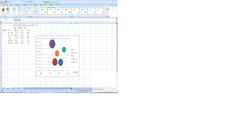
Bubble Graph:A bubble chart is a type of chart that displays three dimensions of data. Each entity with its triplet (v1, v2, v3) of associated data is plotted as a disk that expresses two of the vi values through the disk's xy location and the third through its size. Bubble charts can facilitate the understanding of social, economical, medical, and other scientific relationships.
Further we studied the applications of bubble chart using data from various countries of the world using Excel.
Removed one of the regions, and studied the changes in the bubble graph.
Finally, a video introducing the moving bubble graphs was shown, concluding the session.
Written by: Nishant Renjith
Group members:
Nishant Renjith
Pooja Shukla
Pranshu Agrawal
Prateek Jain
Priyanka Sudan


No comments:
Post a Comment